Güerita
.png)
A vertical cart to organize flowers while they are cleaned
PROJECT YEAR
2018
LOCATION
Queretaro, Mexico
PROJECT TYPE
User Experience Design & Product Design
DESIGN TEAM
Pedro Aguirre Alucema & Daniela Leal Benítez
PROJECT DURATION
5 months
CLIENT
School project
The purpose of this project was to get involved with a trade within the city of Queretaro and apply our knowledge of design, ethnography, and ergonomics to solve a need, a problem, a system, or a service. By so, we wanted to improve the user experience.
Emotions generate feelings in the user, and these are directly related to the experience. The object speaks to the user, creating emotions through identity. With "güerita" we wanted to transmit emotions using colors, textures, and the shape itself.
To start the project, we went in search of our user; therefore, we decided to investigate about different trades within the city. The ones that caught our attention were: bricklayers, shoemakers, tailors, shoe polishers, and florists. We choose florists because we believed they had many areas for improvement, and there is a great diversity of flower shops with different socioeconomic status throughout the city.
Context


Due to the differences between the socioeconomic status of each flower shop, each florist has his own process and has to adapt his work space according to his needs.
Most of the time the process of organizing the flowers when cleaning them was not functional, although the florists said they have been adapting to it.
The process starts when the florist take the flowers from large buckets filled with water. They have to carry the flowers with their arms and place them on their workspace to cut the stems and arrange the flowers for sale.
When they have cleaned some flowers, they place them in another spot nearby to continue cleaning the rest, so they have to move constantly, which means they lose time in doing so.
Finally, the florist places the arranged flowers in the buckets filled with water and the floral arrangements on the display shelves to be sold.
The problem
Ethnographic
Research
During a period of 4 months, we were working with 6 different florists. At this stage of the process, we applied some ethnographic tools such as: shadowing, empathy maps, interviews, participant observation, observation maps, among others, in order to get some behavioral patterns and find our insights.


1. They had a bad posture when working.
2. They had to pick up flower and leaf debris from the ground many times a day.
3. They had to constantly move buckets full of flowers and water.
4. They were having a bad use of their workspace.
5. What they enjoyed doing the most were floral arrangements, they considered it an art.
Insights
6. Their basic working tools were: scissors, a blade and a knife.
7. Their work tools were usually adapted to their needs by themselves.
8. They spent a lot of time standing.
9. They were thorny when grabbing the roses to remove the thorns and clean them.
How could we improve the work experience of local florists by streamlining the flower cleaning process, making it more organized and convenient for the user?
List of demands
1. It had to save some space for the user.
2. It had to have a visual concept in accordance with the user and his environment.
3. It had to be lightweight, easy to use, storage and move.
4. The product had to be versatile, with the possibility of adjusting it according to the user´s needs.
5. The product had to have a space to store their tools and personal belongings.
6. It had to be a waterproof product, it would be in contact with liquids.
7. It had to be easy to clean, with smooth surfaces and no sharp edges.
8. It had to give a friendly appearance.
9. The product had to be easy to assemble and disassemble.
Ideation
Prototyping
Some rapid prototypes were designed to validate functional details (easy to store, easy to move, easy to use, etc.), structural details (materials selection, maximum dimensions, object capacity, etc.), types of joints, among other aspects.


Final Concept
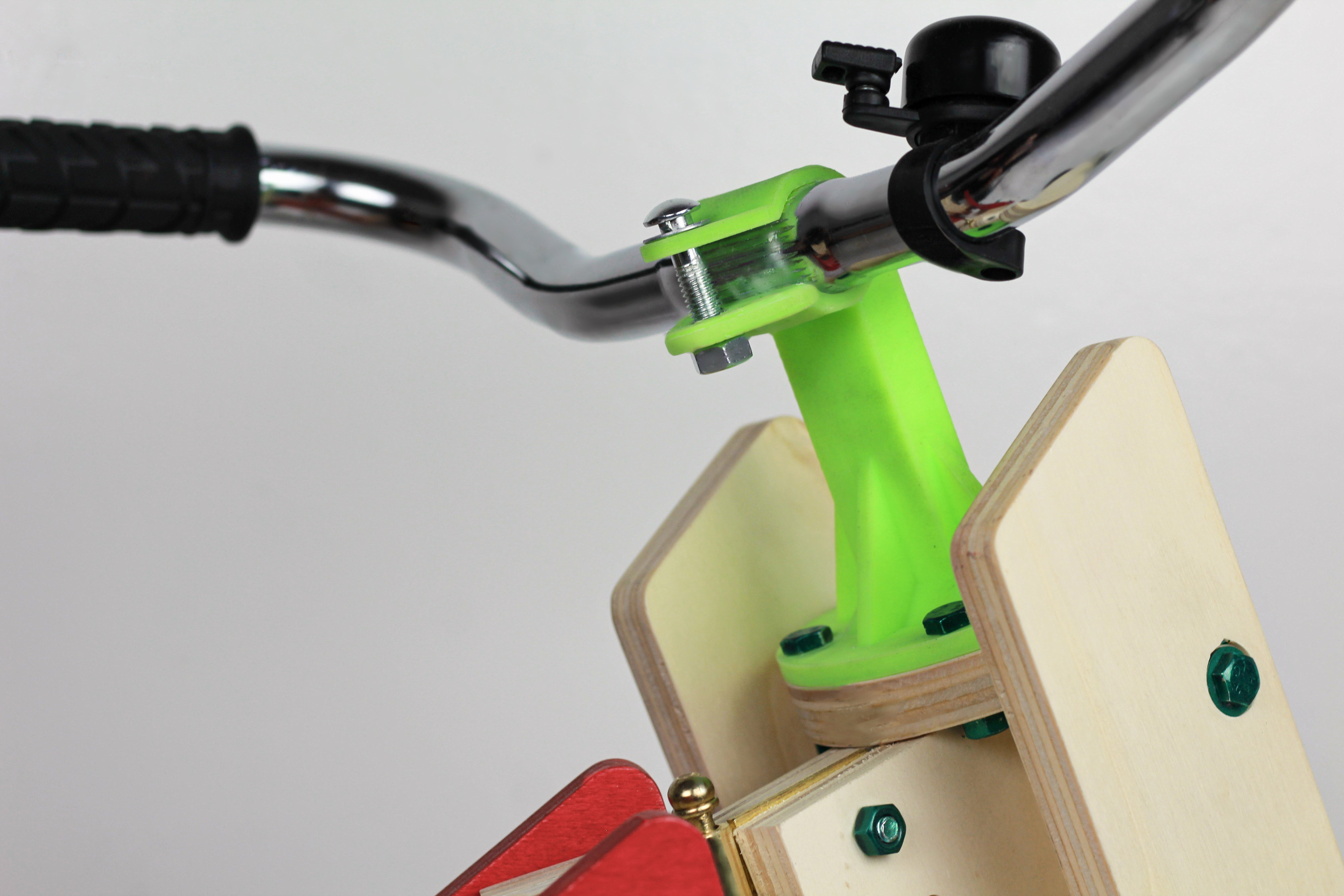
A vertical cart whose main function is to accommodate the flowers when cleaning them.
This cart is composed of a main box in which shelves can be placed in different positions, depending on the user's needs, optimizing space.
The shape of the box is an abstraction of "the huacal" (a box of wooden strips whose main function is to transport fruits and vegetables), to generate a sense of identity and belonging for the users.
The color palette was inspired by the colors found in Mexican markets, as well as traditional Mexican objects.
If you would like to know more about this project, you can watch this video.


.jpg)